parcelLab brand evolution
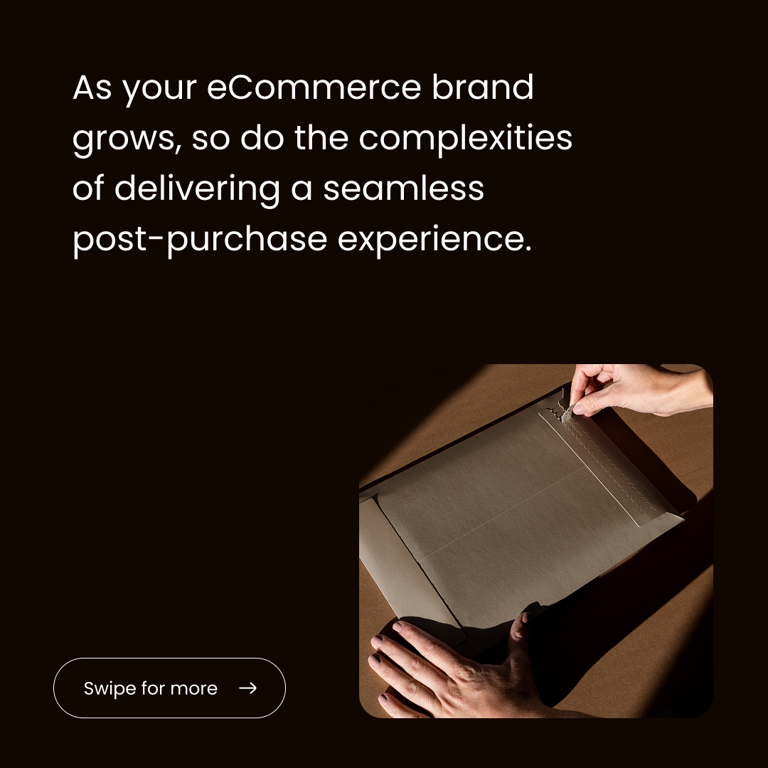
From parcels to presence, redefining what customers feel after they click ‘buy’
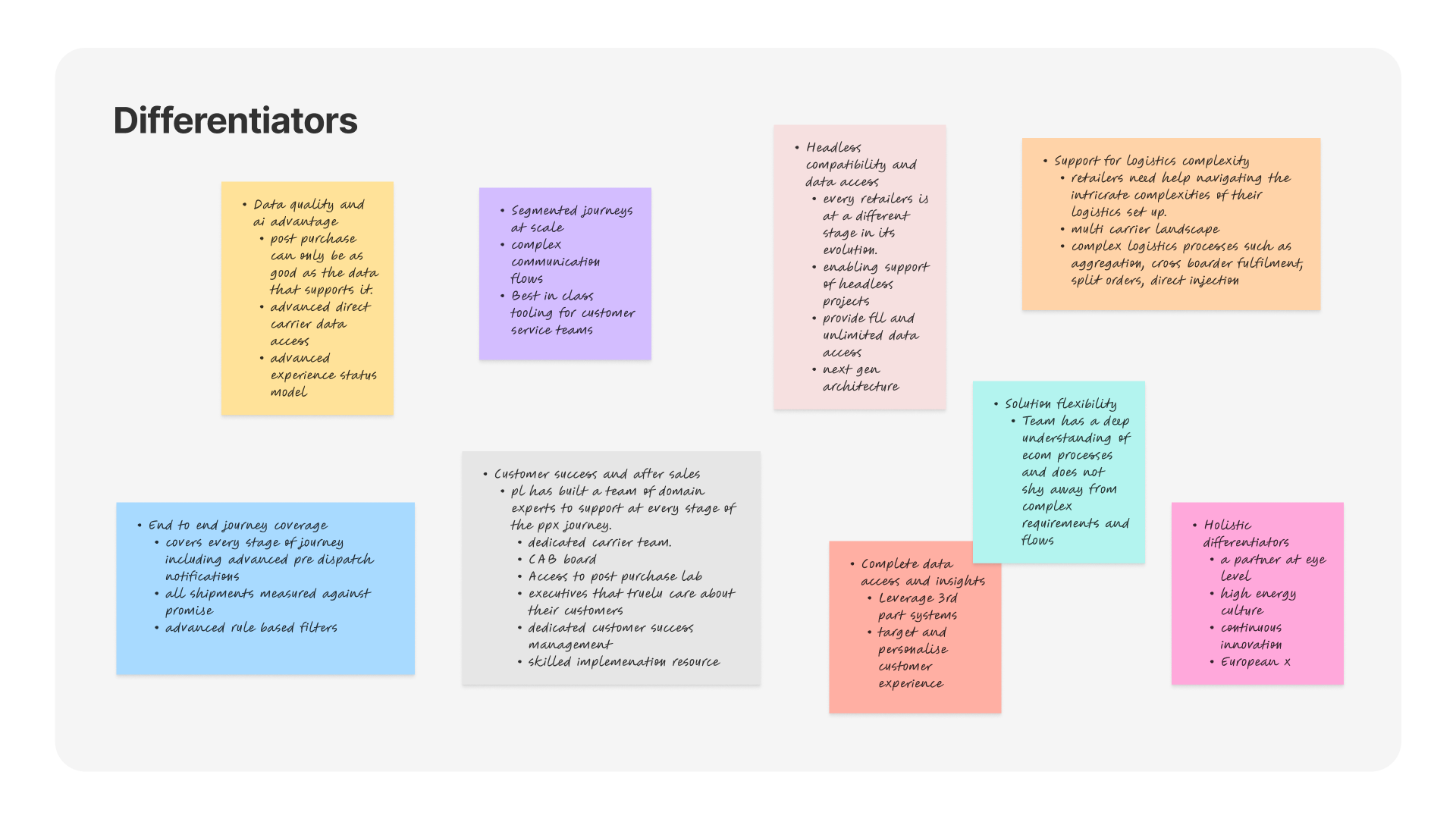
I joined ParcelLab during an ongoing site and brand refresh with limited time to evolve a direction that wasn’t connecting. I led discovery workshops with the marketing team and CMO to refine personas, define brand attributes, and establish archetypes. Within three weeks, we created a flexible brand system to brief the website agency, centring the identity on three differentiators: customer-centric solutions, data-driven insights, and built-in AI agents. The result positioned ParcelLab as a confident challenger to the U.S. incumbent Narvar while reflecting its young, ambitious, helpful culture.
To activate the strategy, I ran a two-week design sprint with a junior designer and directed an external agency across UX and visual design. We produced 500+ brand assets for launch and rolled the system out across digital, social, events, and internal channels over four months.

Product animations
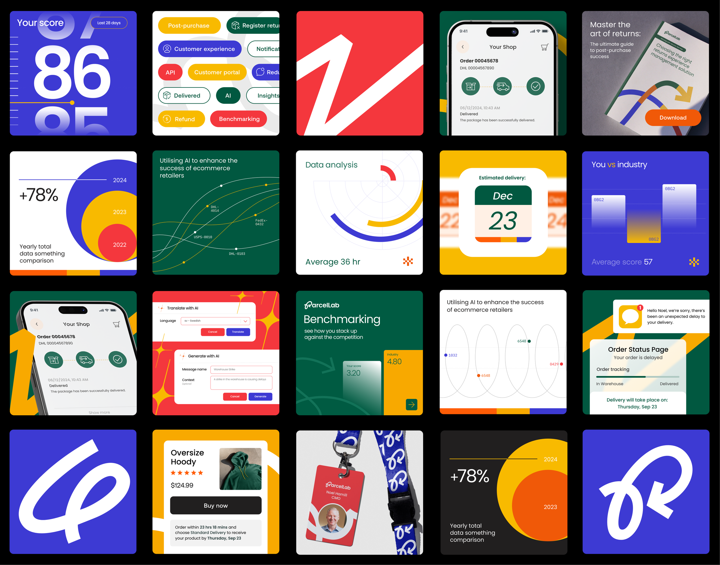
One of the first challenges in designing assets for the website was defining the key product visuals and animations for the homepage and product group pages. These initial elements set the site's visual tone and quality benchmark. Since SaaS product visualisations often feel repetitive across B2B websites, we used bright colours and motion to create a more engaging, distinctive experience that brought energy and clarity to the brand.
Platform visualisation
Platform visualisation to clearly communicate how the product ecosystem fits together. The animation helped simplify complex concepts, making it easier for users to understand the value of the platform at a glance.
Product and feature page visualisations
The website included 24 product groups and feature pages, each containing between 4 and 10 custom product-based graphics. To streamline production, we built a Figma-based design system that standardised components and leveraged colour-coded groupings to differentiate between page types. This approach allowed us to work efficiently while maintaining visual consistency at scale.


Social media and events
After the website launch, we expanded the brand into social media and event graphics, using high-end mockups and photography to elevate the visual identity. This helped reinforce a more premium, polished feel while maintaining consistency across channels.